






MG symbol through the eras
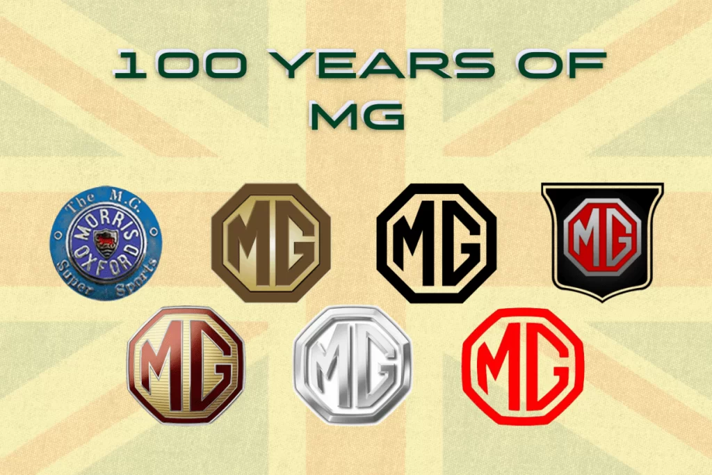
The MG logo has undergone significant changes from the time of its establishment until today. Starting with a wheel disc featuring the brand name in the center, through development stages, the MG logo marks milestones throughout a rich history of nearly 100 years. Not only a matter of changing fonts and colors or adding new design elements, the innovation of the logo clearly reflects MG’s decisive spirit of transformation and its focus on the future of mobility for MG.
The birth of an iconic heritage (1924 – 1930)
The beginning of the MG logo was a miniature shield surrounded by the words “Morris Oxfords” on a purple background. The capitalized, elegantly elongated lettering reflected the spirit of the 1920s while marking the Morris factory in Abingdon, Oxford – where the first MG cars were born. This was a flourishing period with development ideas from the founder, to create a distinct brand with outstanding sporty characteristics, pursuing perfection.
The immortal symbol (1930 – 1990)
After its founding phase, MG clearly defined its path and core values. The new logo represented a fresh chapter and embodied the brand’s enduring spirit. MG simplified its design by removing all intricate elements. The team placed the stylized ‘MG’ abbreviation at the center of an octagonal symbol for good fortune. During this period, MG achieved a boom in sales as well as developed a series of new products in different segments.
Starting in the early 1960s, the brand incorporated red to symbolize prominence and determination, reflecting its adaptability in a changing world.
Innovation (The 1990s – Early 2000s)
Entering the 1990s, while on one hand MG maintained respect for traditional heritage, it also continued to change to reflect the spirit of the times. The logo returned to the refined capital letters “MG”, written in a modern and bold font, demonstrating mobility and adaptability to new technology. This innovation conveyed a sense of stability and honored the brand’s heritage, summarizing its journey through changing periods.
Vision for the future (Late 2000s – Present)
With the continuous development speed of technological progress and the market, the MG logo once again embraced change. With the octahedron block formed, the upper part of the letter “M” now resembles the shape of an open car door. Later, the MG lettering was designed with thinner, smoother, and cleaner lines, showing sophistication and progress. This transformation summarizes the modern spirit, ambition, and sporty character, reflecting the brand’s future vision where technology and design blend perfectly.
The journey of the MG logo is a testament to the ability to maintain core values on the journey of continuous evolution to meet the requirements of each era. Throughout the past 100 years, MG has shaped a distinct position in the global automotive industry, delivering benchmark British cars in terms of both emotion and operational capability.
For any consultation information regarding MG product and service support, please contact the Customer Care department at phone number +84 28 3535 9915.
SAIC MOTOR VIET NAM COMPANY LIMITED
16th Floor, Vincom Center Dong Khoi, 72 Le Thanh Ton Street, Ben Nghe Ward, District 1, Ho Chi Minh City, Vietnam
